Changelog

What changed in the map, the country comparisons and the details that help you choose where to move. Follow along with the RSS feed.

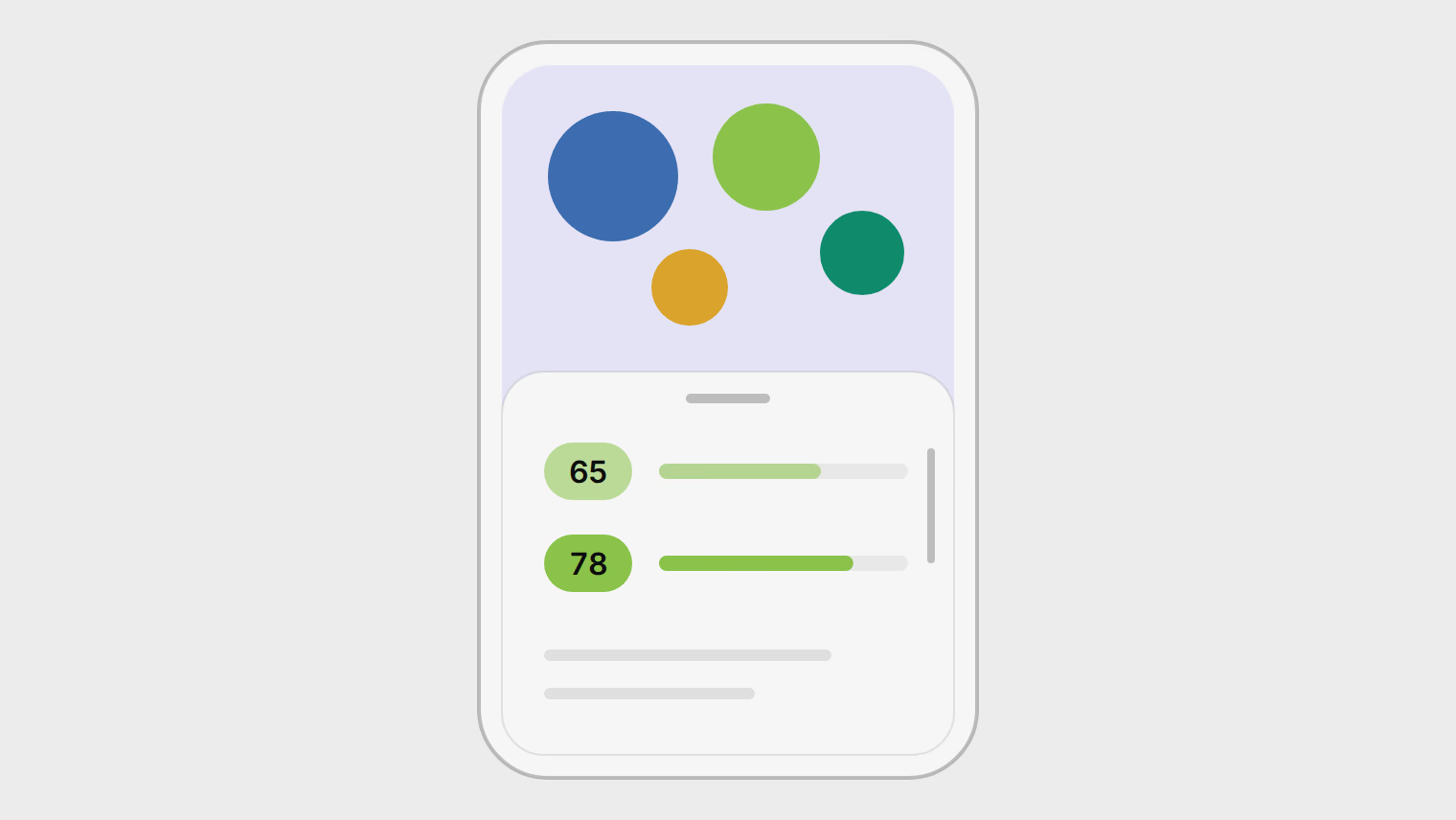
A phone with the map above a half-height detail sheet, where scores of 65 and 78 get different tints of the same colour.
LatestVersion 0.1.1

Keep exploring while you read

Country details are easier to read on a phone, with the map still in view. Score colours also show more of the difference between countries in the same band.

  • Improved2
  • Fixed2
  • More precise score colours. Badges, pills and scorecard bars now use lighter and darker tints for scores that share a colour band.

  • Room for the map. On phones, the country detail sheet rests in the lower part of the screen and leaves space for the iOS safe area.

  • Details that stay on screen. Long country details scroll inside the sheet instead of pushing it off the screen.

  • Smoother touch scrolling. A flick at the top or bottom of the details scrolls the content instead of dismissing the sheet.
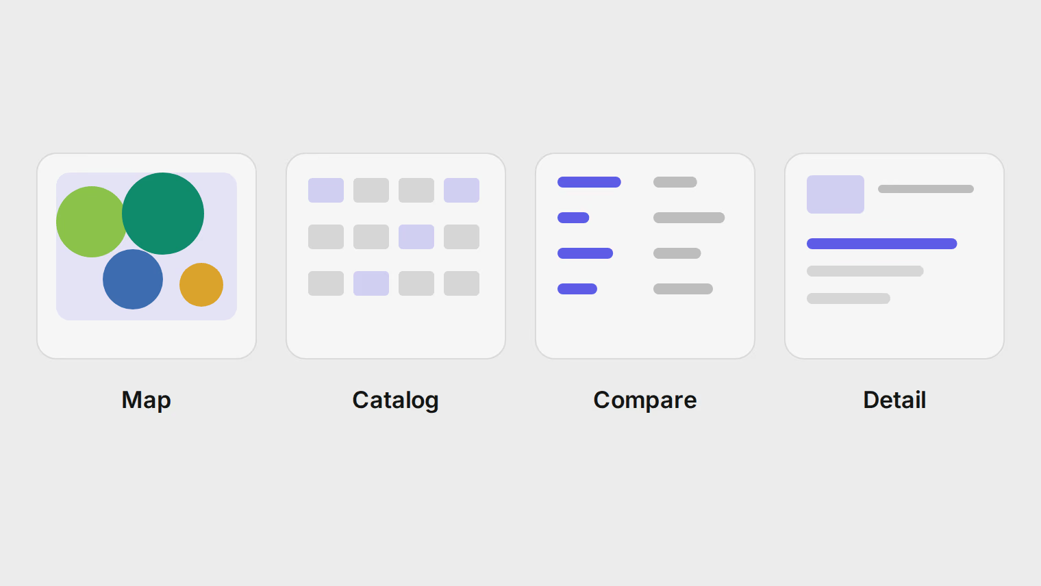
The four views of the first release: map, catalog, compare and country detail.
Version 0.1.0

Explore countries your way

The first public release brings the world map, country catalog, side-by-side comparisons and country details together, with search and filters to build a shortlist.

  • Added4
  • Four ways to explore. Browse the interactive map and the catalog, compare countries side by side, or open a full country detail view.

  • Scores for every lens. Each country is scored on citizenship, residence, taxes, work, safety, healthcare and more, with an overall score.

  • Find a starting point. Country search, filters and presets narrow the options.

  • A view that fits. Resize the desktop detail panel, open details in a sheet on phones, and choose a light or dark theme.